Let’s create an artwork together. This time, we’ll take a relaxed pace with a familiar topic: pearl jewellery and flowers. I usually start with an interesting subject on Pinterest, as in this case. I was drawn to a painting of a pearl necklace draped on a velvet base of a metal jewellery box, with a hydrangea-filled background. We will paint it without much alteration.
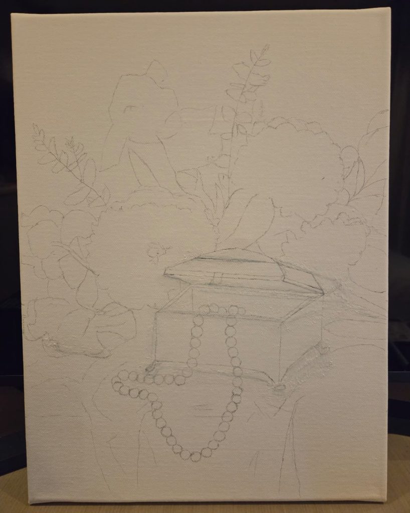
The first step is to sketch. Some artists like to sketch with paints right away, but I often draft it with a pencil. I didn’t study art, so it’s more habit than anything. I draw lightly on the canvas, but sometimes it leaves a line or two. I then amend it when I paint those areas. Starting off with paints to sketch might produce thicker layers as alterations require layers of colors.
It took half a day to draw the scale and aspect. This painting has three objects and two sides of the background. You will need to decide which objects are the main focus. Since the pearl necklace and the jewellery box are the main subjects, we’ll draft their details as we go. The irises, the hydrangea, the wall, and the drape are the backdrops, so we will give them shape as we finish the draft.
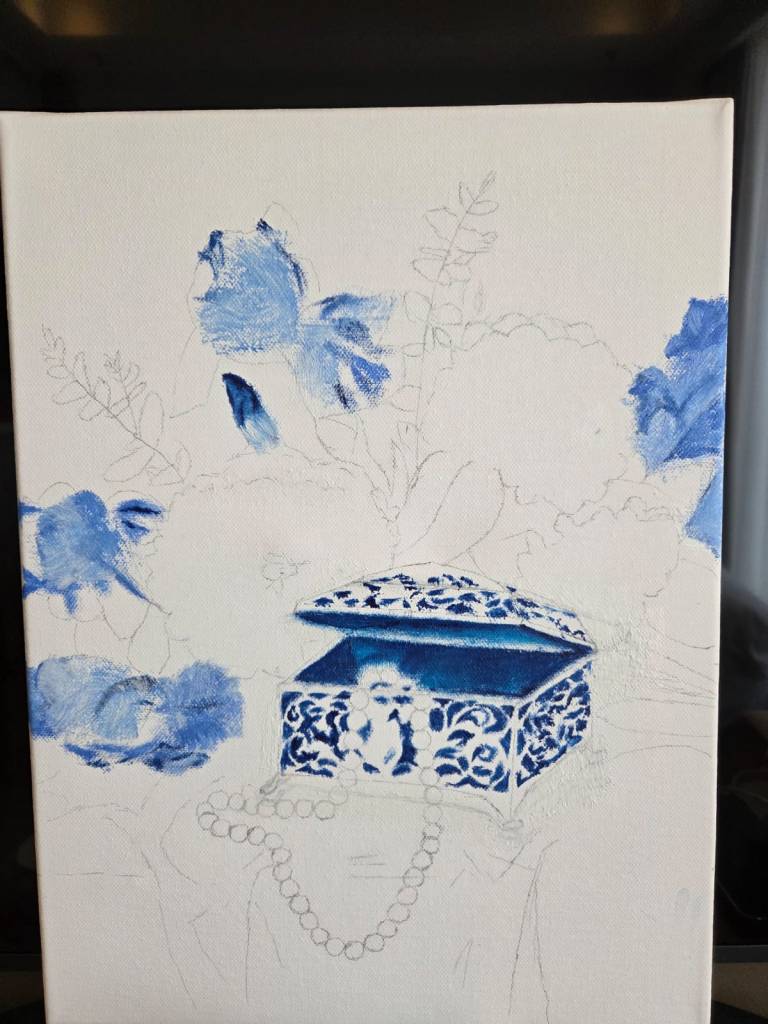
We will paint with acrylic. Regardless of the subject, we start off with high-intensity colour, the mainstream school of painting. Since we paint darker colours first, we will start with blue and green, which are the velvet base of the jewellery box, the irises and the stems and leaves of all the flowers.
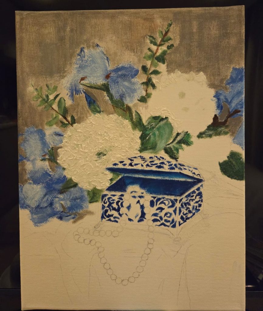
As we painted the brown stems and green leaves around the hydrangea, I used the remaining green and white colours to paint a fluffy white hydrangea bloom. I used thicker layers of paint to highlight the petals of the flowers.
It’s time to add the lighter colours, which are the main parts of our primary subjects in the painting. The jewellery box’s metal case took me 25% of the time to paint. The details resembled flower branches. Also, the lid has multiple levels, which needs to be painted by aligning lines with the right angles at each level. I used two brown hues and a yellow hue to achieve the antique metal look of the case. I also adjusted the hues to show aspect of the case.
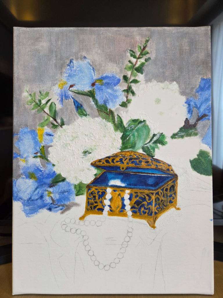
Since we are adding lights to the metal jewellery box, we will also paint the shiny pearls. The previous painting with pearls in it had higher exposure to light, so the pearls appeared whiter. If you observe our referenced painting closely, this pearl necklace seems to be painted in normal lighting on a creamy-coloured silk cloth. Therefore, the pearl also looked creamy with grey shades reflecting other objects.
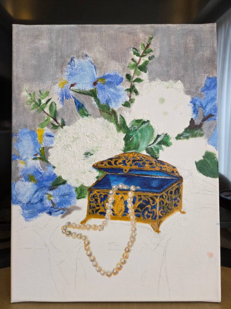
Next, we will make the metal case surface look more symmetrical on both sides. We will also paint the silk drape and another ball of hydrangeas before refining the entire painting.
You can view all of my completed artworks here. Thank you for painting with me!


Leave a comment